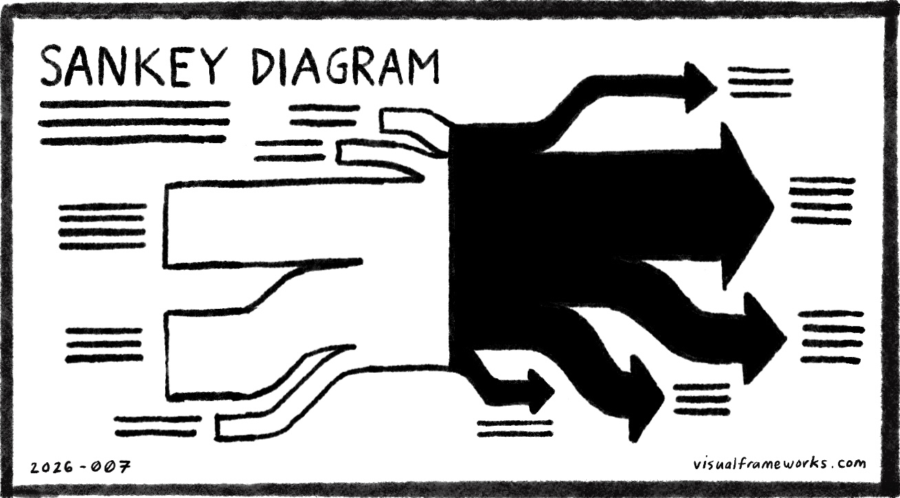
A Sankey diagram is a flow chart in which the width of each arrow is proportional to the quantity it represents. Developed in the nineteenth century by Irish engineer Matthew Henry Phineas Riall Sankey to visualize the energy losses in a steam engine, it shows not just what flows from one place to another but how much, making loss, concentration, and distribution visible at a glance. Thick rivers narrow into tributaries; tributaries merge into rivers. The diagram holds the whole system in a single image.
Most flows are invisible. Money moves through a budget, attention through a day, energy through an organization, but we rarely see where it goes or how much arrives at each destination. A Sankey diagram makes that visible: the wide stream entering a process and the thin trickle reaching the outcome. The gap between input and output, often assumed away, becomes undeniable.
Where is energy coming from and where does it go? Can you follow the streams from source to destination? What would you do differently if you could see all the flows at once? Are you feeding streams that produce almost nothing downstream? What would it mean to change the sources of the flows? What if you could change the destinations?
See also: Pipes and tanks, Funnel, Bottleneck, Filters, Dashboard, Measurement, Root causes, Decision tree, Flowchart, Journey, Causal loops.
2026-007